
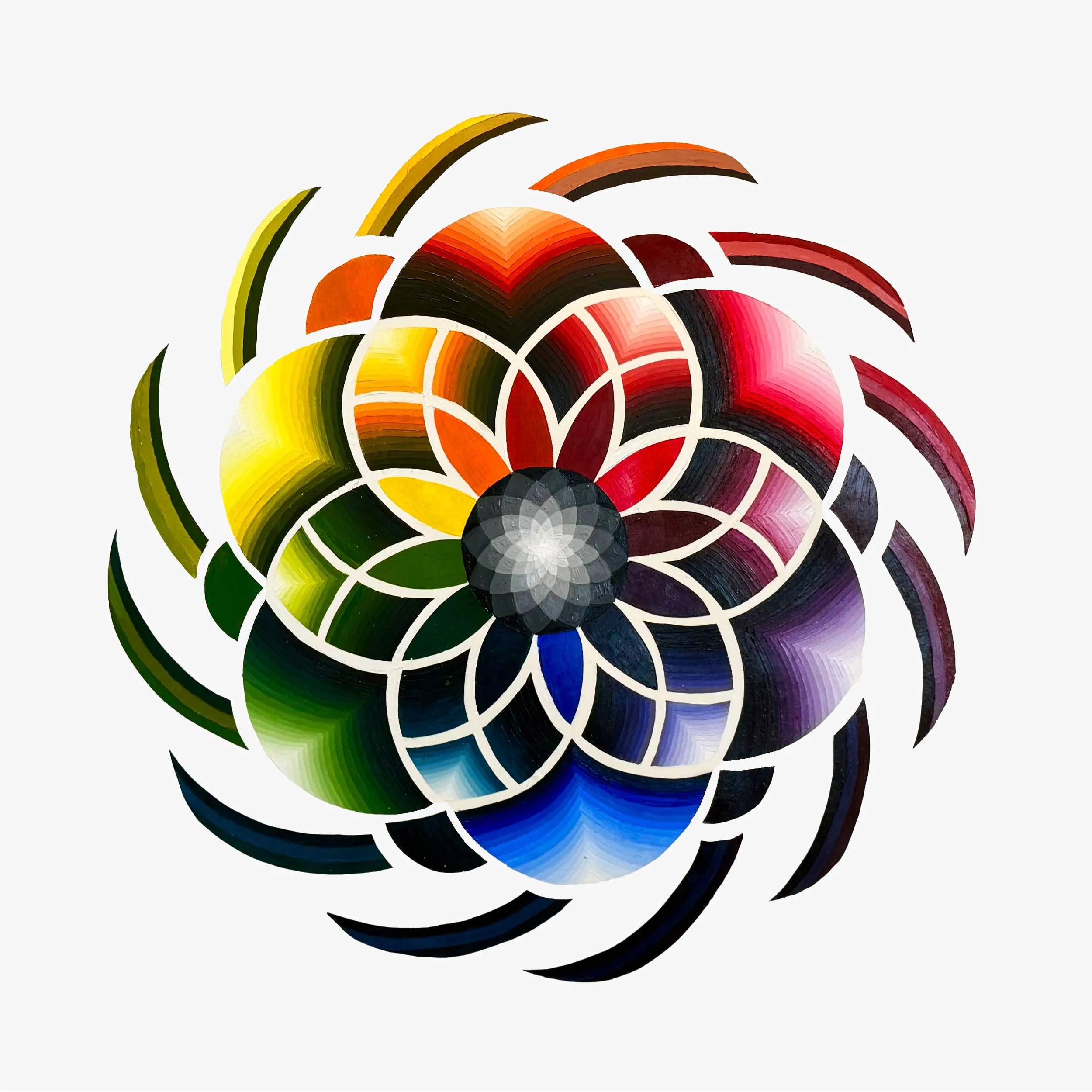
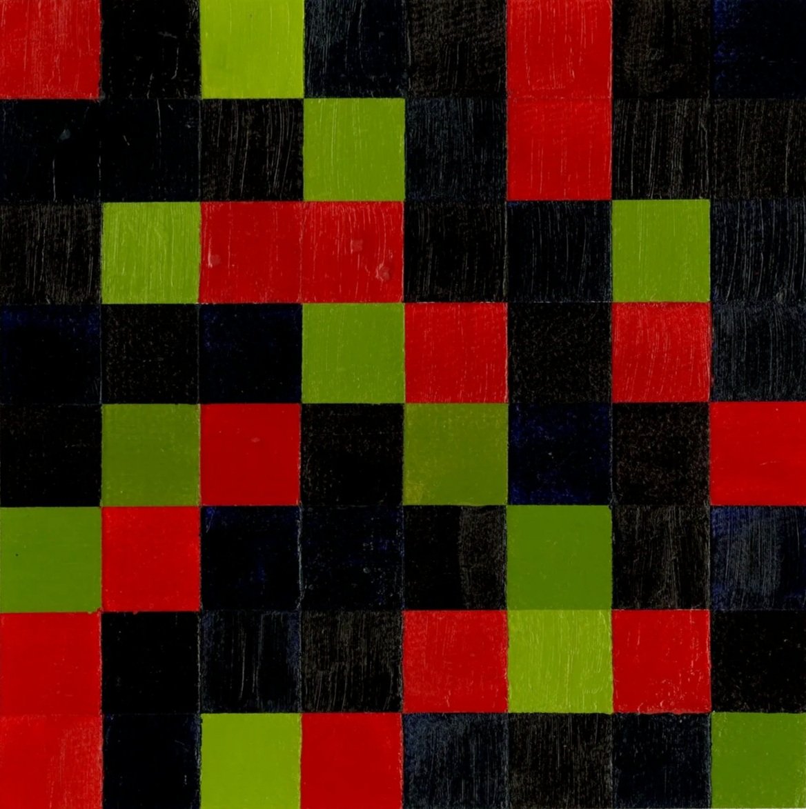
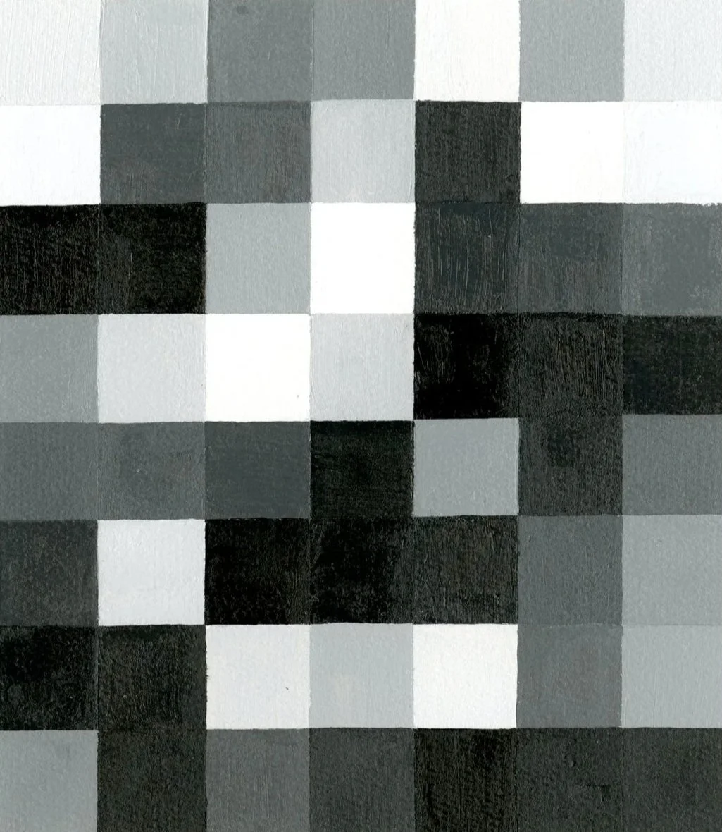
Crafted with careful attention to color and composition, this project transforms a traditional color wheel into a dynamic visual exploration of hue, tint, and value. Each 24” x 36” watercolor paper wheel features 12 vibrant hues, layered with at least seven tints, a 10-step grayscale, and nuanced shadows, highlights, and colored greys, demonstrating the full range and subtlety of each color.
After experimenting with four layout ideas, a single design was developed and a full hue section painted to test mixing, balance, and spatial flow. The resulting piece merges precision with creativity, offering a harmonious study of color that is both analytical and visually engaging.
PROJECT
YEAR
Color Wheel
2024
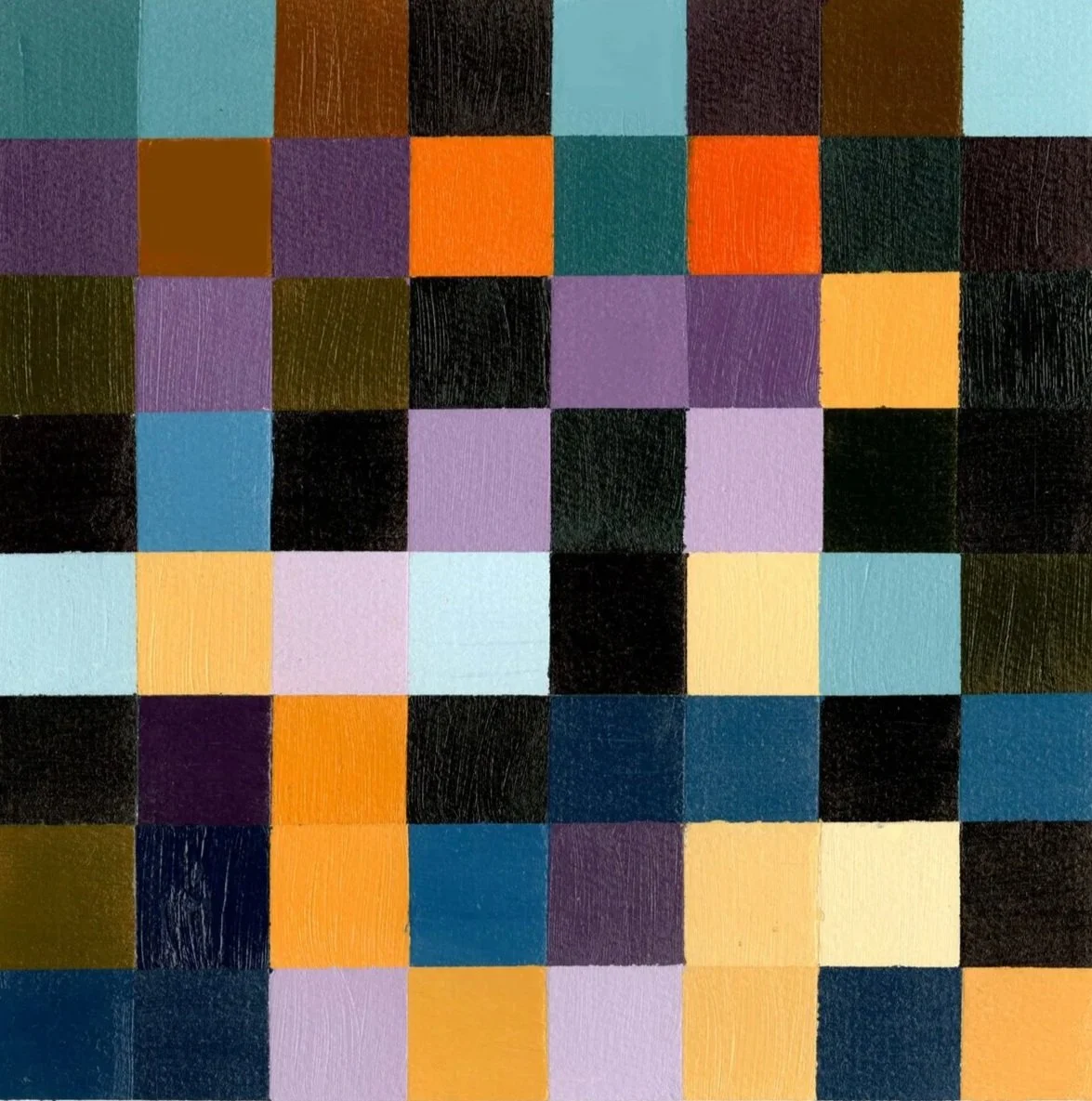
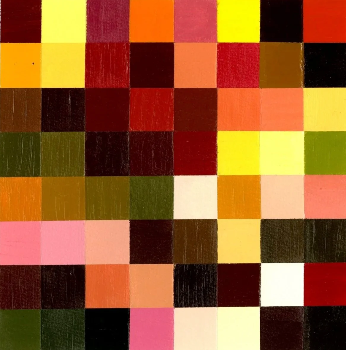
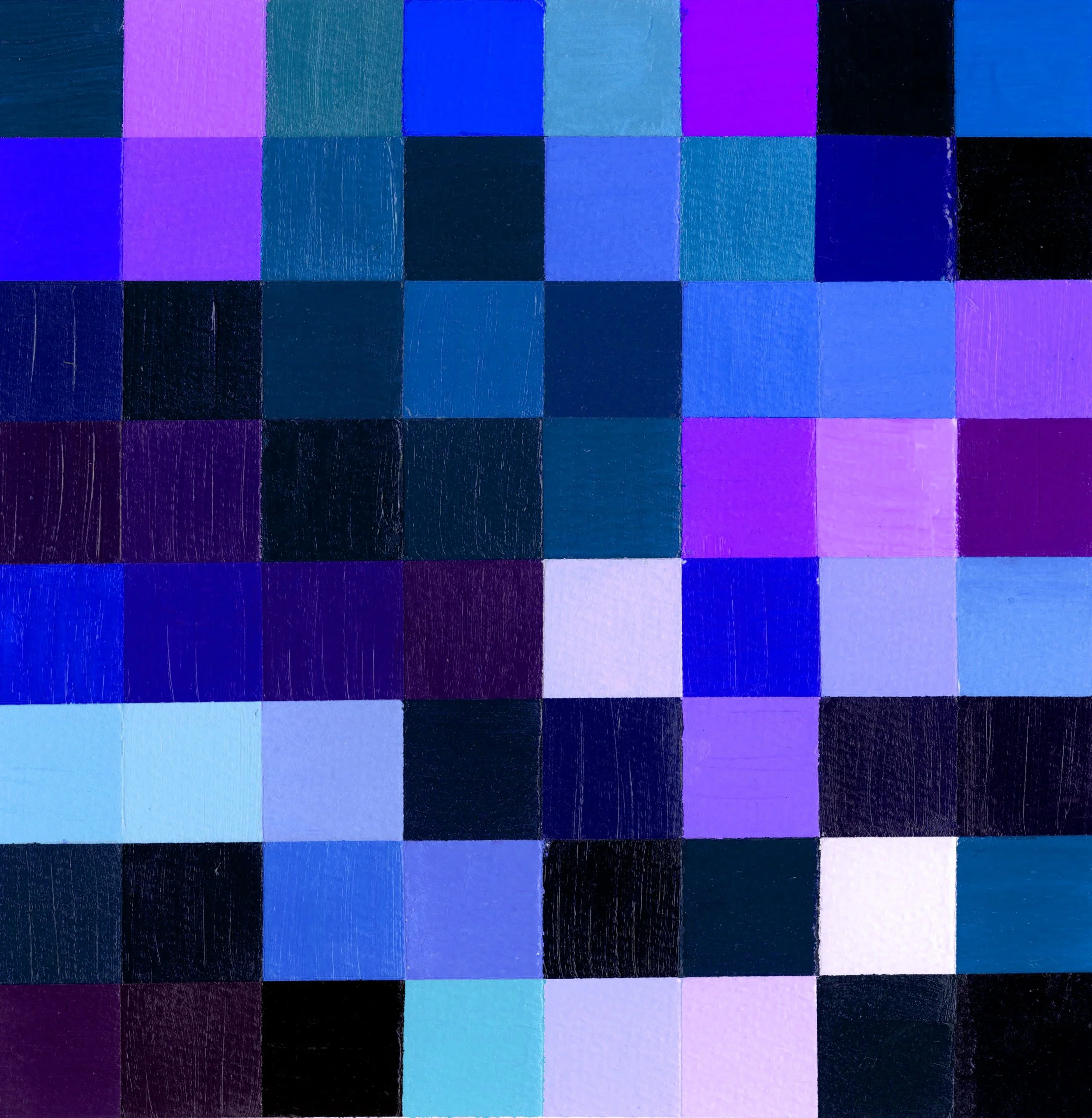
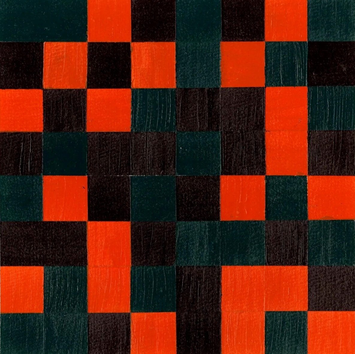
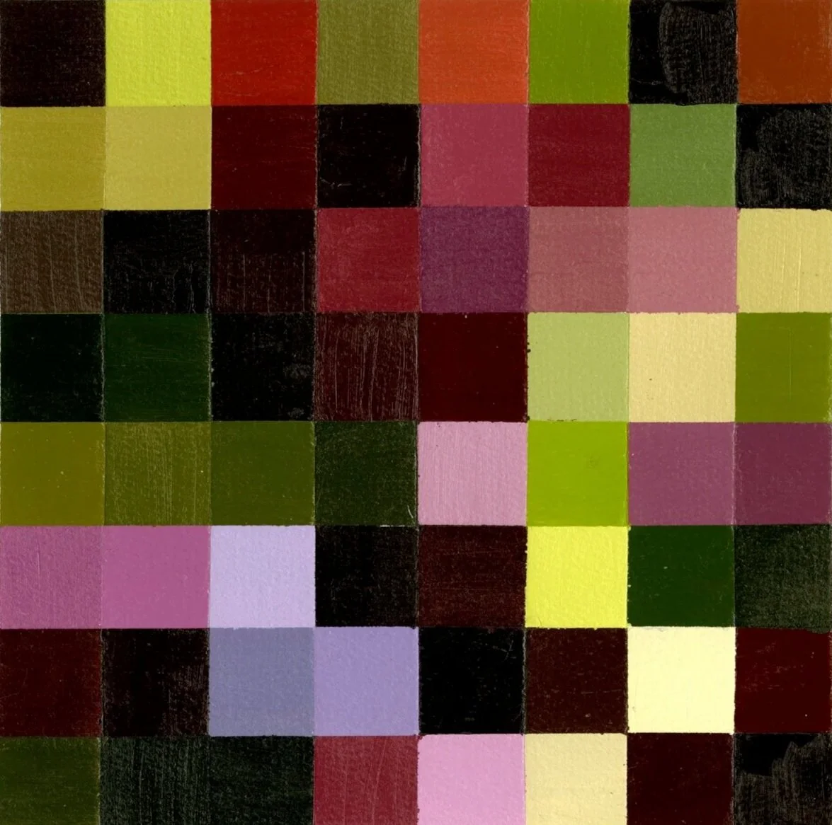
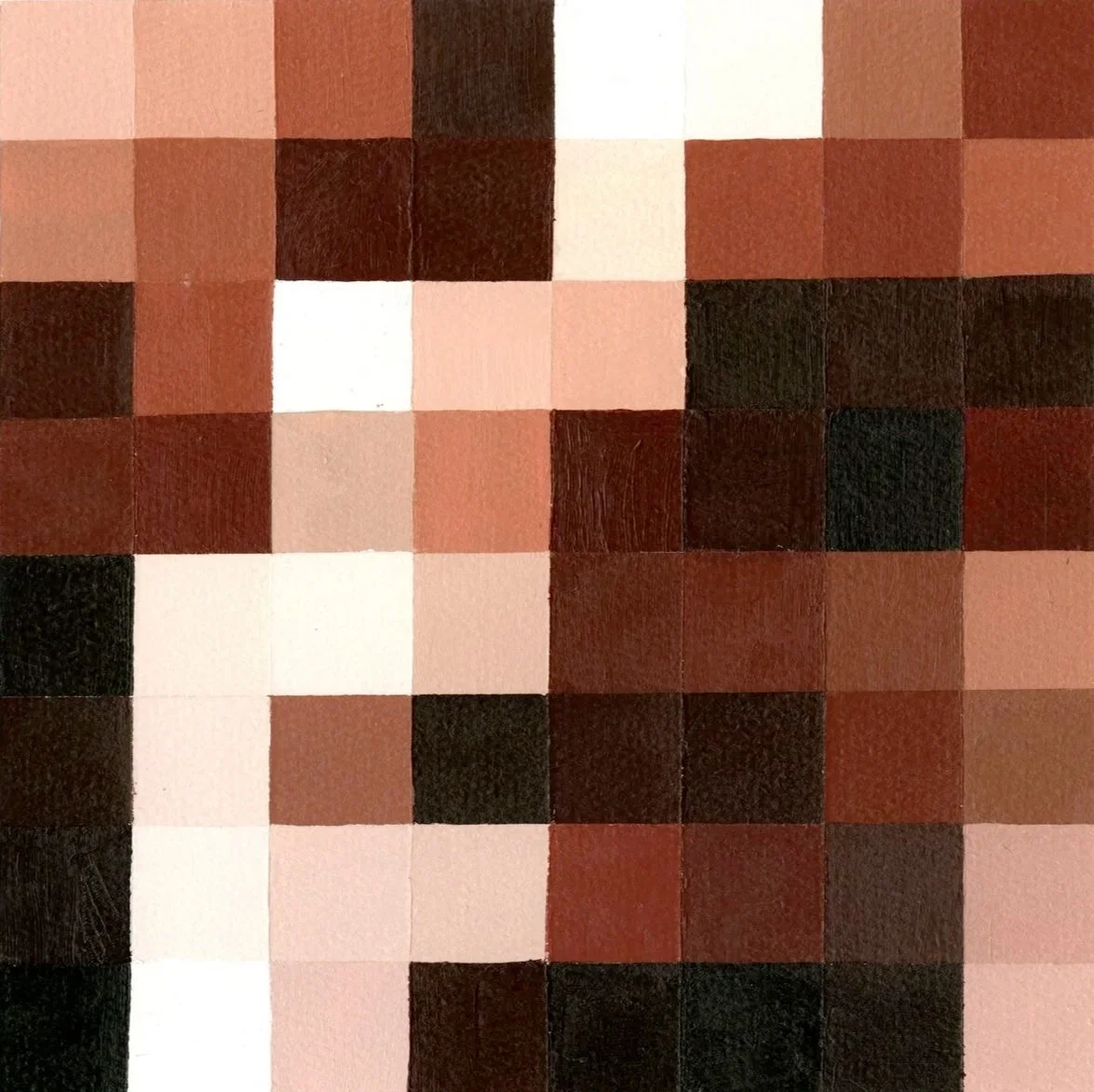
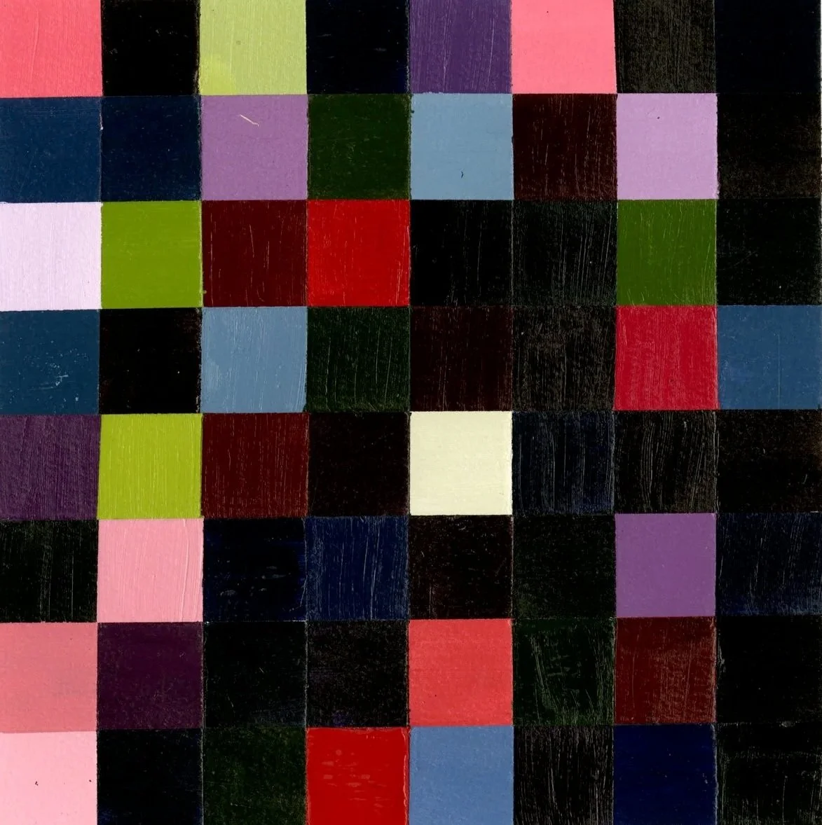
Exploring the interplay of light, dark, and visual hierarchy within a single hue, this project used color chords to create harmony and express emotion. Each study, an 8x8” exploration of a carefully chosen 3- or 4-color chord—translated a selected emotional word into a visual language, deliberately avoiding primary-only combinations.
Through nine thoughtfully crafted color studies, we observed how hues shift in identity when placed beside others, and how value, saturation, and contrast shape emotional perception. The project strengthened skills in complex color relationships and laid the groundwork for developing a personal, expressive visual style.